On the web
Take a mechanical watch apart in your browser, gear by gear
The Mechanical Watch essay renders a full movement in your browser, every gear draggable. Explorable explanation has a high-water mark and this is it.
Somewhere in your family there was a person who took the clock apart to see how it worked and could not put it back together. This page is for that person, with the putting-back-together solved.
Mechanical Watch, by Bartosz Ciechanowski, renders an entire watch movement in your browser: mainspring, gear train, escapement, balance wheel, all of it 3D, all of it live, every mechanism driven by sliders you drag to run time forward and backward through the mechanics. You do not read about how the escapement stops the gear. You stop it, yourself, and feel the logic click.
The internet noticed. The essay went up on May 4, 2022, and its Hacker News thread sits at 4,298 points, which puts it among the most upvoted pages in that site's history.
What the sliders actually teach
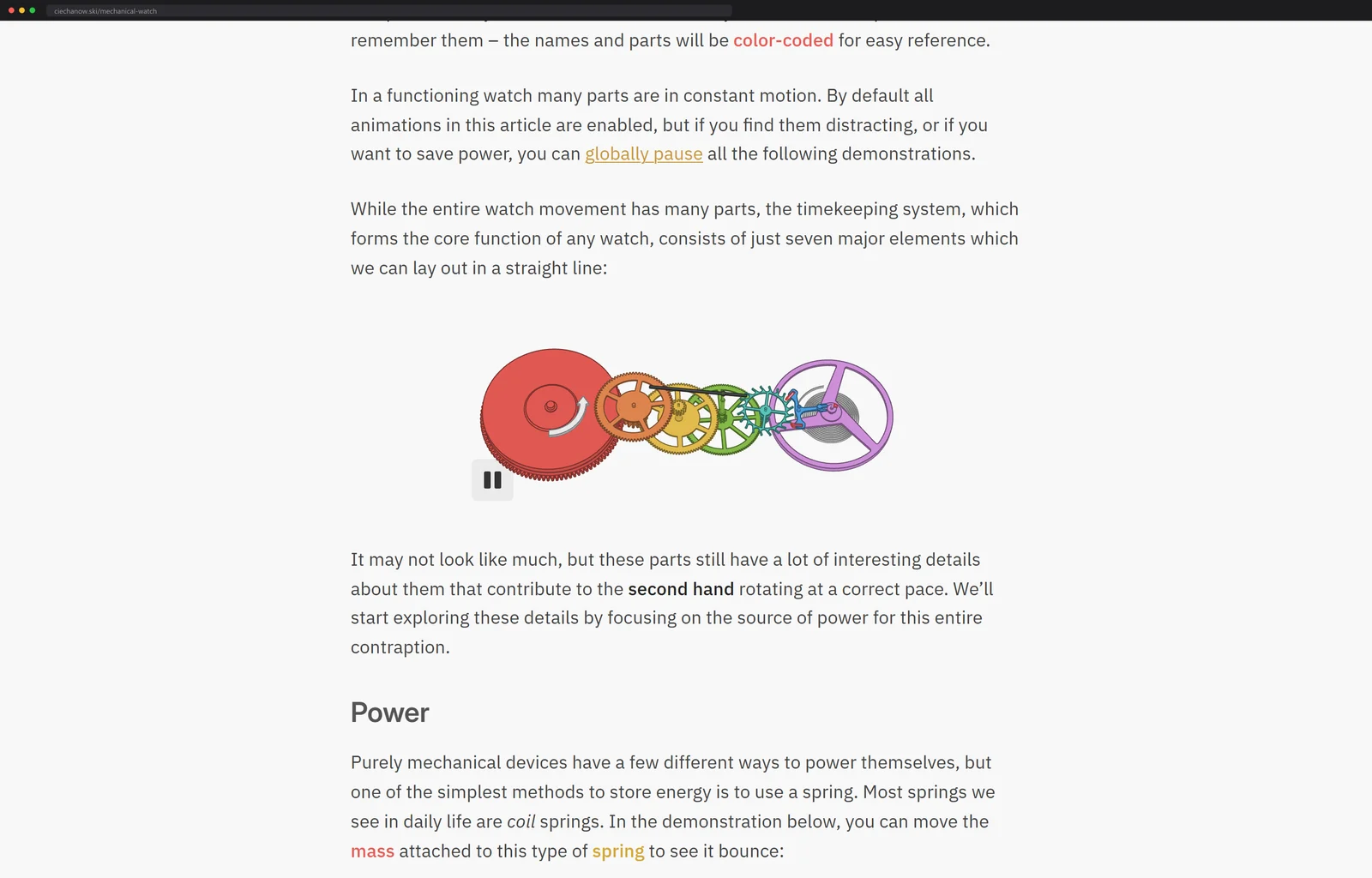
The essay runs about seven thousand words, and the count undersells it, because the figures carry half the argument. The tour starts at the mainspring, where a slider lets you wind the coil and a second figure shows the click, the little ratchet pawl that keeps your winding from undoing itself the moment you let go.
Then the gear train, with the ratios live, so you watch one slow revolution of the barrel become the quick spin of the escape wheel. Then the escapement itself, pallet fork and escape wheel tooth by tooth, which is where the ticking sound of the entire mechanical-watch species turns out to live.
The regulator of all of it, the balance wheel, oscillates at 28,800 beats per hour in the modeled movement, eight per second, which is why a mechanical second hand glides where a quartz one jumps. And the drilldown keeps going past where anyone would have forgiven him for stopping: the keyless works that explain what the crown actually does when you pull it, the date ring with its jumper spring, the automatic winding rotor, and a closing slider that shrinks the whole exploded mechanism back down to wrist size.
If you only have five minutes, spend them on the escapement figure. It is the one where a shape you have seen in a thousand logos suddenly resolves into a machine with a job.
My favorite detail is a footnote-grade one: watch gears do not use the involute tooth profile that almost all large machinery runs on, but cycloidal profiles suited to tiny high-ratio trains, and the essay bothers to model the difference.
The supporting cast gets figures too: the mainplate everything mounts to, the jeweled bearings that cut friction at the fastest pivots, the bridges that cage the gear train, and the spring-mounted shock protection that is the reason a dropped watch usually survives the floor.
Hand-rolled WebGL, no engine
I went through the source expecting to find a framework and found a craftsman. The page is 89KB of HTML without a single canvas element in it; every figure is conjured at load time by two hand-written scripts, a 34KB base library and a 327KB watch.js. Search those files and you find raw WebGL calls, createShader and drawArrays, and no trace of Three.js or any other engine. The dozens of interactive figures run on code with no dependencies at all.
The zero-dependency choice is not purity for its own sake; it is longevity engineering. There is no framework here to fall out of date, no package to rot, and the page runs today exactly as it ran on launch day in 2022. I loaded it again this week to check. Every slider still slides.
The care goes all the way down. There is even a global toggle wired into the page that pauses every animation at once, for readers who want the figures to hold still.
For scale: that 327KB watch.js, the entire three-dimensional watch with every figure in it, costs less transfer than the tracking scripts on plenty of pages that render nothing at all.
That is the whole stack: hand-modeled geometry, hand-rolled rendering, prose in between, and the same treatment has been given to engines, airfoils, sound, bicycles and the Moon. Each essay takes months. His archive shows one to three a year, with the bicycle essay standing alone in all of 2023, and his Patreon charges per article rather than per month, from $4.50 an essay, with 543 people currently paying. A subscription that only bills when the work exists is its own kind of receipt.
Ten years of the same obsession
The archive runs to 24 essays across a decade, and reading it in order is its own story. It opens in 2014 with iOS engineering posts, the internals of NSDictionary, drawing Bezier curves, GPGPU experiments on iPhones, then goes quiet for five years and returns in 2019 as the physics essays the internet knows. The 2019 return year alone shipped five, Tesseract and Alpha Compositing and Color Spaces among them, and the peak is 2022, with three full interactive worlds in twelve months: GPS, this watch, and Sound.
Run the Patreon arithmetic and the economics come into focus: 543 patrons at the $4.50 floor is north of $2,400 per essay before the higher tiers, paid voluntarily, for pages anyone can read free. The market has quietly priced this work, and the price agrees with the Hacker News score.
The ambition has kept climbing since. Airfoil, from February 2024, is a chain of small wind tunnels you steer yourself, velocity arrows and pressure fields recomputing as you drag the angle of attack, with a very him caveat attached: the simulations are simplified, please do not use them to build an airworthy airplane. Moon, the latest, landed that December.
I went looking for the conference talk or long interview where he explains his method, because for almost anyone else at this level one exists. I could not find it. The closest thing to a statement of process is his own description of the whole enterprise as a weekend hobby, which, set against 24 of these, might be the most quietly intimidating sentence on the open web.
The bar it sets
The craft lesson for anyone who explains things for a living: the interactivity is never decoration. Each slider exists because the concept it drives is genuinely easier to grasp in motion. That is the bar. Most interactive content fails it. This page is why we know the bar exists, and the blog where every diagram is a toy you can grab clears it by the same means, live widgets instead of pictures.
The genre he sits on top of
The genre has a name, explorable explanations, and a hub: explorabl.es, an open-source collection run by a self-described disorganized movement of artists, coders and educators who make these things.
Two entries from that lineage are worth your next two evenings. Amit Patel's guide to hexagonal grids at Red Blob Games has been up since March 2013 and continuously revised since, nearly every diagram in it answering your mouse; it is the page a generation of game programmers learned hex math from. And Parable of the Polygons, by Nicky Case and Vi Hart, turned Thomas Schelling's 1971 segregation model into a 2014 playable where you drag unhappy triangles and squares around a board and watch a small individual bias become a segregated map.
The same muscle pointed at hardware is the Nand Game, which hands you a single logic gate and does not let go of you until you have wired a working CPU.
If the hand-rolled part sounds like the fun part, WebGL Fundamentals teaches the same no-magic approach from a blank file: raw WebGL, no frameworks, exactly the road Ciechanowski walks.
Clear an hour. It will take twenty minutes and you will spend the other forty dragging the balance wheel back and forth like the tinkerer you were always going to be.
More machinery worth loading: the datacenter in the hallway runs eighty-nine apps behind zero open ports.

Next up
The phone in your pocket outruns the first teraflop supercomputer