On the web
The whole planet, drawn as columns of people
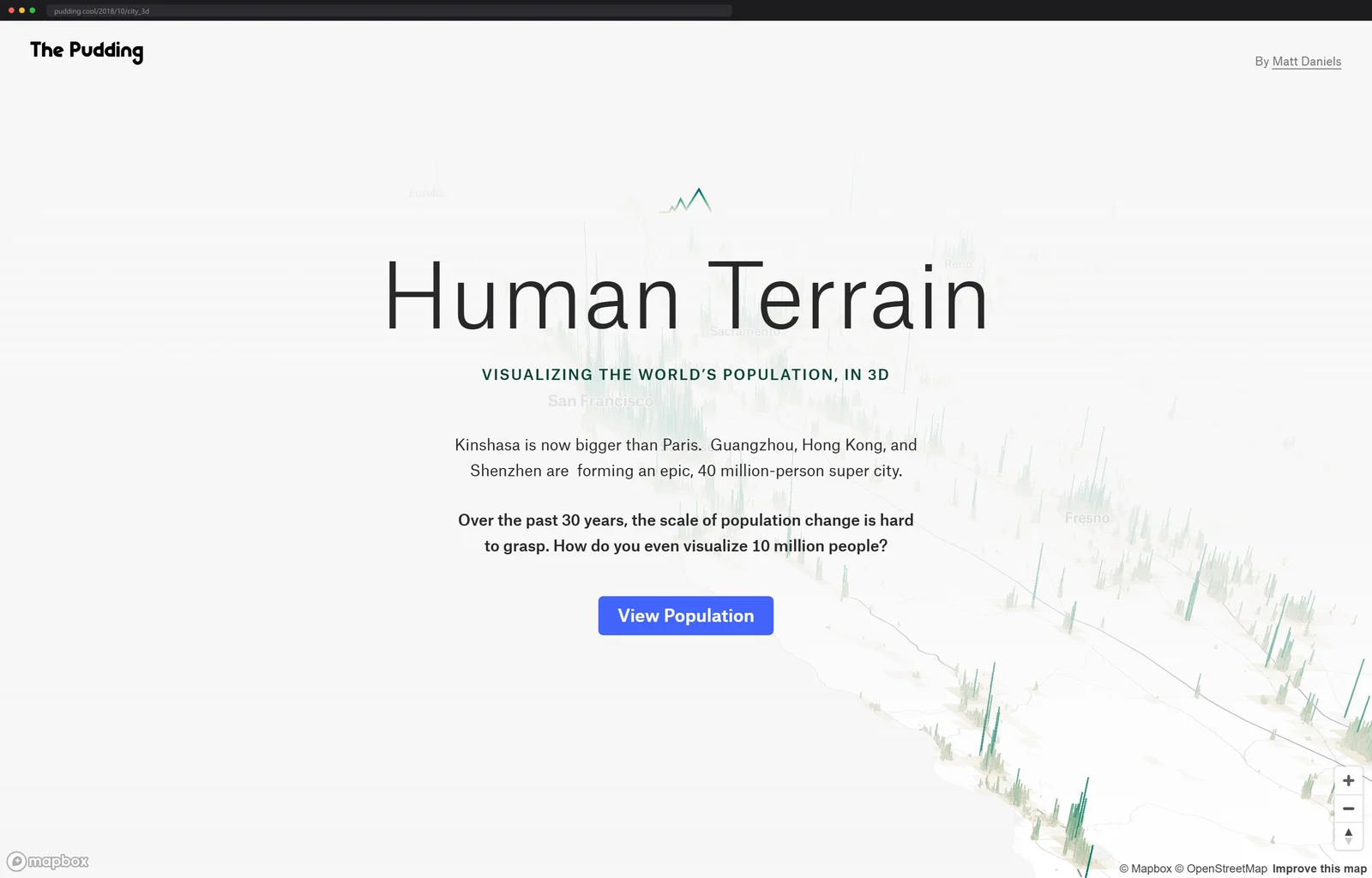
The Pudding's Human Terrain renders global population as 3D columns on a map, built from satellite settlement data served as Mapbox vector tiles so it stays smooth.
Cities stand up off the map. Every place people live becomes a column, and the denser the place, the taller the spike, so a metro area reads as a small mountain range of population and an empty valley stays flat. Drag to pitch the camera back down and the mountains fold flat into an ordinary map; it is the same data either way, which is the point.
Human Terrain, an interactive map by Matt Daniels at The Pudding, is trying to solve a real problem: ten million people is a number nobody can feel. Drawn as a wall of columns you fly through, city by city, it finally has a shape. Kinshasa overtaking Paris stops being a statistic and becomes a taller pile, and a 1990 view lets you watch three decades of growth stand up out of the ground.
I spent longer in that 1990 toggle than I planned to. Flip it and the Pearl River Delta deflates, Lagos shrinks back toward its lagoon, and the Nile valley barely moves, one continuous wall of people hemmed in by desert on both sides, already full a generation ago. Thirty years of urbanization, told as geology.
The data is a satellite census
The heights come from the Global Human Settlement Layer, a European Commission dataset that fuses satellite imagery, census counts, and volunteered geographic data into a global grid of how many people live in each cell, at resolutions down to 250 meters. The whole thing is published as open data, which still startles me: a satellite census of everyone, downloadable by anyone.
Sit with what 250 meters means. A cell is a few city blocks, and covering just the planet's land surface at that size takes over two billion of them. The grid also comes in multiple epochs, which is what makes the 1990 time machine possible: same cells, same method, an older count.
At that resolution the raw data runs to terabytes. Loading it all at once would choke any browser, and most desktop GIS tools besides.
So Daniels processed it in Google Earth Engine, which let him run Python against the full dataset on Google's infrastructure and export only the layer he needed, between ten and twenty TIF files, instead of downloading the world.
From satellite grid to columns on your GPU
Then the pipeline. GDAL's gdal_polygonize turned those rasters into shapefiles, the shapefiles became GeoJSON files over a gigabyte each, and Tippecanoe crunched the GeoJSON into tilesets at three resolutions: five-kilometer cells for the world view at zooms 0 through 4, one-kilometer cells for the middle zooms at 5 and 6, and the full 250-meter grid from zoom 7 up close. A tile-join pass merged them into a single tileset uploaded to Mapbox.
That tiling is the whole trick. The browser only ever downloads the patch of planet you are looking at, at the resolution your zoom level deserves. Mapbox GL then draws each cell as a fill-extrusion, a flat polygon pulled upward in proportion to its population value, and the pulling happens on your GPU. A terabyte-scale dataset, scrolling like butter.
Splitting the work that way is the quiet lesson of the piece. Everything expensive, the terabytes, the polygonizing, the simplification, happened once, offline. What ships to your browser is geometry with one population attribute per cell, and the only live computation left is the extrusion itself, handled by the same fill-extrusion primitive Mapbox uses to raise 3D buildings on ordinary street maps.
The tiler has its own lore
Tippecanoe, the tool doing the heaviest crunching in that pipeline, deserves its credit line. Built at Mapbox, it is now developed and maintained by Erica Fischer at Felt, sitting at 1,600 stars and 1,996 commits on its main branch, BSD licensed, still actively worked on.
Its entire job is editorial judgment at scale: deciding which features deserve to exist at which zoom level so a tileset stays small without visibly lying about the world. A population map lives or dies on exactly that call, which is why Daniels could lean on one flag-driven command where a GIS department used to sit. There is even a flag that sheds the densest features first when a tile would blow its size budget, which is a one-line summary of cartographic generalization, a whole academic subfield, as a command-line option.
Raised terrain is becoming a genre
Human Terrain went up in 2018. The recipe, settlement data measured from orbit plus GPU extrusion in the browser, now has siblings.
Kontur's population dataset is the one I would reach for to build something like this today: the globe binned into H3 hexagons, made by fusing the same GHSL satellite layer with Meta's population estimates, then constrained against OpenStreetMap and Microsoft's machine-traced building footprints so a hexagon cannot claim residents where there are no roofs.
And the extrusion move is not reserved for statistics. Streets GL, sighted here in September, stands OpenStreetMap itself up into a sunlit 3D city in one tab: volunteer-drawn walls instead of census counts, the same flat map pulled upright.
The payoff is an argument
You think you know which cities are large. Then you watch southern China fuse into one continuous ridge of thirty and forty million people, and the abstract number lands.
Height does something color never manages here. A choropleth caps out; once a region hits the darkest shade, Dhaka and a mid-sized suburb can read as the same ink. A column has no ceiling, so the outliers get to look like the outliers they are, and the shock arrives through the same channel you use to judge mountains.
My own flight path, for the record: Dhaka, which is less a city here than a spike field, the island of Java reading as one long serrated blade, and the strange flat quiet of the American interior once you leave the coasts. Every viewer will find a different unsettling ridge. That is the design working.
Daniels published the whole pipeline as a step-by-step build tutorial on the Mapbox blog, Earth Engine script to final map style, if you want to raise terrain of your own. The companion essay, Population Mountains, is his guided tour of what the columns reveal.
If the full pipeline reads like a cliff face, Mapbox's documentation keeps a worked population-density example that fits on one screen of JavaScript: Rwanda's provinces, colored by people per square kilometer through a data-driven expression. It is flat rather than extruded, but it is the first rung of the exact ladder Daniels climbed, and you can run it tonight.
One number I wanted and never found: how many people have flown through this thing. The Pudding does not publish per-story traffic, so the only crowd size I can report is the skyline's.
More huge things rendered so you can grasp them: an endless factory floor one person keeps drawing, and a scroll wheel that goes eleven kilometers down.
Next up
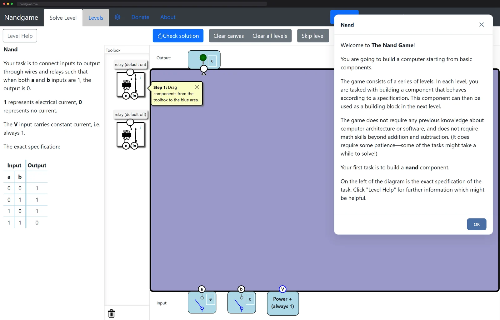
Build a working CPU starting from a single NAND gate